
How to Style a Coastal Living Room with Dark Accents

Why dark accents work so well by the sea
Coastal decorating has something of a reputation problem. Say the words "seaside living room" and most people picture striped cushions, rope-wrapped lamp bases and a great deal of duck-egg blue. It can be charming, but it can also feel like a holiday let rather than a home you actually live in. The remedy isn't to abandon the coastal mood — it's to give it something to push against.
Dark accents do exactly that. A deep navy sofa, charcoal window frames or an ink-dark alcove behind open shelving give all that soft, sun-bleached linen something to sit against. The result reads as considered and grown-up rather than themed. It's also quietly practical: dark upholstery hides the marks sandy feet and damp dogs leave behind, and dark joinery doesn't show the salt haze that plagues white frames on an exposed coastline.
Build a soft base before you add anything dark
Dark accents only feel sophisticated when there's plenty of light, quiet space around them. If you paint the walls navy and add a navy sofa and a navy rug, you haven't created contrast — you've created a cave. So start pale and build the darkness in deliberately.
Think chalky, limewashed walls in off-white, bone or a barely-there grey rather than a flat brilliant white, which can look harsh in coastal light. For floors, seagrass, jute or a pale limewashed oak keep things grounded and slightly rustic without shouting. Then choose your upholstery in washed linen, brushed cotton or a soft wool bouclé in oatmeal, stone or sand.
Once that pale, textural layer is in place, a single dark element will land with real impact. Without it, the same dark piece just looks like a mistake.
Choose your dark with intent
Not all darks are equal, and the undertone matters more than the shade itself.
- Inky navy: the most forgiving option and the easiest bridge from a classic coastal palette. Look for navy with a grey or green undertone rather than a purple one, which can turn sugary in bright sun.
- Charcoal: softer and more modern than black. A charcoal with a hint of brown or olive feels warmer and works beautifully with aged brass and natural timber.
- Slate and blackened blue-green: ideal for joinery — window frames, doors and panelling — because they echo the sea and sky without being literal about it.
- True black: use sparingly, in small doses such as lamp bases, curtain poles or picture frames. A whole wall of it will swallow the light you've worked so hard to keep.
Always test a large sample patch on the actual wall. A navy that looks rich in a south-facing room can turn flat and cold in a north-facing one, and coastal light is unforgiving about these things. Two darks in a room is plenty — pick one hero and let the second appear only in small details.
Where dark accents earn their place
The trick is to use dark where it does a job, not simply where it fits.
- Chimney breast or alcove: a single dark wall behind a pale sofa anchors the whole room and makes shelving look curated rather than cluttered.
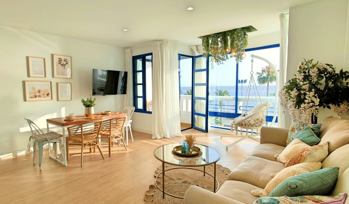
- Window joinery and skirting: dark frames turn a view into a framed picture. They also disguise weathering far better than white.
- Internal doors and panelling: half-height tongue-and-groove painted in charcoal gives a coastal room structure and stops it feeling flimsy.
- Curtains: heavyweight linen in charcoal or slate, hung from a dark metal pole, adds weight and warmth without blocking the light entirely.
- Soft furnishings: a dark rug border, a couple of cushions in deep navy or a wool throw draped over a pale armchair — small, movable, low-commitment.
Layer texture and light to stop it feeling cold
Dark surfaces absorb light, so you need to give it back elsewhere. Mix finishes rather than matching them: matte walls with a slightly chalky finish, unglazed ceramic lamps, aged brass hardware, blackened metal legs, washed timber, a woven jute rug and one or two pieces of leather that will patina over time.
Lighting does the heavy lifting. Use several warm sources rather than one overhead — table lamps on side tables, a floor lamp angled into a dark corner, a picture light over artwork. Bulbs around 2700K flatter dark paint and make navy look rich instead of gloomy. Avoid anything glossy or high-shine near dark walls; it reads cheap and reflects every fingerprint.
Getting the balance right
A useful rule of thumb is roughly eighty per cent light, twenty per cent dark. If you find yourself wanting more, add a third texture before you add a third dark tone.
Keep the coastal reference quiet and indirect. Bleached driftwood, a bowl of pebbles, a linen shade, a woven basket for logs — one or two of these is enough. Skip anchors, rope, lobster pots and anything with a lifebuoy printed on it. The seaside should be suggested by light, texture and colour, not announced.
Above all, let the room look lived in. Coastal interiors work best when they feel like they've been assembled over years rather than styled in an afternoon — a bit of wear, a slightly faded cushion, a rug that's seen some sand. Dark accents give all of that a confident frame to sit inside.

Joeby Ragpa
This template is so awesome. I didn’t expect so many features inside. E-commerce pages are very useful, you can launch your online store in few seconds. I will rate 5 stars.
ReplyAlexander Samokhin
This template is so awesome. I didn’t expect so many features inside. E-commerce pages are very useful, you can launch your online store in few seconds. I will rate 5 stars.
ReplyChris Root
This template is so awesome. I didn’t expect so many features inside. E-commerce pages are very useful, you can launch your online store in few seconds. I will rate 5 stars.
Reply