
Using Muted Colour Palettes in North-Facing Rooms

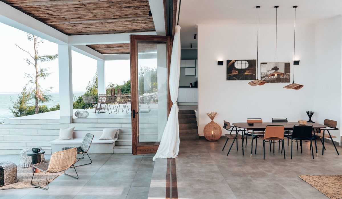
Why North Light Changes Everything
A north-facing room in a British coastal home is a room with its own personality. It rarely receives direct sun, so most of its light arrives second-hand, bounced off the sky. That light carries blue wavelengths, which means it is cool, soft and famously unforgiving to certain colours. A warm, chalky cream that looks buttery in a south-facing bedroom can turn grey and slightly bruised in a north-facing sitting room. A soft lilac looks fresh elsewhere and faintly institutional here.
None of this is a problem to solve. It is a condition to work with. The trick is not to fight the light with strong saturation, but to choose muted colours with the right undertones and then build up warmth with texture, timber and lamplight. North light is steady and even, which makes it wonderful for reading, painting and quiet mornings — it simply needs a little help after four o'clock, especially from October onwards.
Warm the Undertones, Not the Saturation
The single most useful rule is this: in a north-facing room, look at the undertone of a colour before you look at the colour itself. Muted, chalky shades already contain a degree of grey, and cool light compounds it. Choose versions of those shades built on a red, yellow or yellow-green base and the room will feel warm even when the light is not.
Whites are where most people go wrong. Pure brilliant white and blue-based whites reflect the cold light back at you and make everything else look dingy beside them. Instead, look for off-white, chalk white, linen white, shell or almond — any shade described as warm rather than crisp or arctic. Use the warmest of them on ceilings and woodwork, where they will lift the whole room.
Greys can absolutely work, but they need to be warm greys: greige, mushroom, taupe, warm stone. Avoid blue-greys and slate shades unless you are deliberately leaning into a cool, moody scheme. Cool sage, lilac-based neutrals and grey-washed woods will all flatten in this light.
Palette Ideas That Work With Cool Light
- Warm chalky white or almond on ceilings and trim, to bounce what light there is.
- Mushroom, taupe or warm stone on walls — muted enough to feel calm, warm enough to hold their colour.
- Soft plaster pink or dusk rose, a natural fit for coastal cottages and a reliable way to warm a north wall.
- Muted ochre, honey and caramel, used in lampshades, cushions and ceramics rather than whole walls.
- Sage, olive or eucalyptus green with a yellow base — seaweed and dune-grass tones rather than cool grey-green.
- Faded indigo and denim blue as accents only, layered over warmer neutrals.
- Sea-washed terracotta and brick for rugs, pots and small furniture; it reads as warmth without shouting.
Along a coastline, this palette has an added advantage: sand, pebble, driftwood and faded paint are exactly the colours the landscape offers, so the room sits naturally against the view.
Layer Texture to Bring Back Warmth
Where colour can only do so much, texture does the rest. Cool light flattens flat surfaces, so a room full of smooth emulsion, painted board and plain fabric will always feel a little chilly. Introduce surfaces that catch and hold light, and the same palette suddenly feels generous.
- Flooring: start with seagrass, sisal or jute, then layer a wool rug on top. Bare polished boards in a north room can look austere.
- Textiles: wool, linen, bouclé, brushed cotton, sheepskin and a good heavyweight throw. Mix weaves rather than matching everything.
- Curtains: unlined linen or a wool-mix curtain with a slight sheen will soften the glass without blocking the light. Avoid heavy dark window dressings.
- Natural materials: rattan, aged brass, hand-thrown pottery, unglazed ceramic and driftwood. They add colour temperature without adding colour.
- Art and mirrors: a large framed mirror opposite the window, and a few pieces of art with warm grounds, will spread light into dark corners.
Texture is also the easiest thing to change with the seasons. Swap a linen throw for wool in November and the room shifts with you.
Lighting, Metals and Timber
Artificial light matters more in a north-facing room than anywhere else in the house, so choose it deliberately. Warm white bulbs around 2700K, on dimmers, in three or four low-level sources — a floor lamp, a table lamp, a picture light — will do far more for the atmosphere than a single bright ceiling fitting. Cool white LEDs will undo every good decision you have made.
Metals behave in the same way as paint. Aged brass, copper, warm pewter and antique gold all glow in cool light, while chrome and brushed steel tend to reinforce it. For timber, look at oak, ash, walnut, cherry and reclaimed pine. Pale grey-washed or limed finishes can look beautiful elsewhere but often turn ashy here; if you love them, use them in small doses against a warmer background.
Test Carefully, Then Live With It
Never choose a colour for a north-facing room from a paint chart, a phone screen or a friend's south-facing kitchen. Buy sample pots, paint them onto A2 pieces of card, and move them around all four walls. Look at them at eight in the morning, at two in the afternoon and again at eight in the evening with the lamps on. In the UK, north light shifts dramatically between June and December, so if you can, keep the samples up for a fortnight and watch them through a grey week as well as a bright one.
Then bring in the layers: a warm rug, a wool throw, a brass lamp, a jug of dried stems. A north-facing room is not a cold room — it is a room that rewards patience. Get the undertones right, keep the palette muted and generous, and it will feel calm and inviting from breakfast through to the last cup of tea.

Joeby Ragpa
This template is so awesome. I didn’t expect so many features inside. E-commerce pages are very useful, you can launch your online store in few seconds. I will rate 5 stars.
ReplyAlexander Samokhin
This template is so awesome. I didn’t expect so many features inside. E-commerce pages are very useful, you can launch your online store in few seconds. I will rate 5 stars.
ReplyChris Root
This template is so awesome. I didn’t expect so many features inside. E-commerce pages are very useful, you can launch your online store in few seconds. I will rate 5 stars.
Reply